Accordion list
The Accordion list component enables duplication of cards or rows with consistent structure in an accordion, allowing for containment of other components. By default, editing or moving a component will apply changes to all cards or rows, while still allowing customization and exceptions for unique values per component.
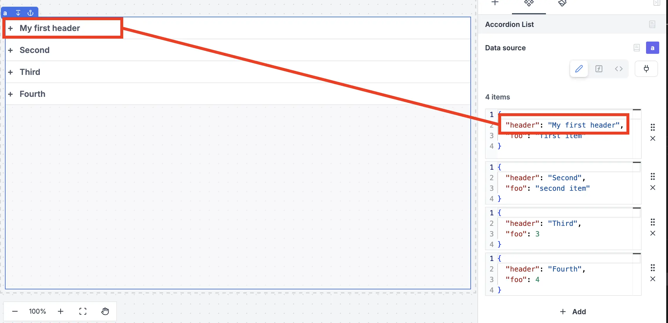
Accordion header
To set the header of an accordion, you can pass a header property of each of the items passed to the Accordion list component.
To add a component to a card, you can either click on Insert while you select the container, or you can move an existing component by copy/pasting it.
Editing or moving a component will apply changes to all cards or rows.
To customize the settings of all components within, you can use iter.index and iter.value.
-
iter.indexwill retrieve the index number of each card (0, 1, 2 etc.). -
iter.value.keywill retrieve the value of each key defined in theitemssection.
List components also support having inputs set inside them. Retrieve the values of each in the inputs field of the List component in the outputs menu.
The following section details Accordion list component's specific settings. For more details on the App editor, check the dedicated documentation or the App editor Quickstart:
Controls
This component can be controlled by frontend scripts using these functions:
| Name | Parameters | Description | Example |
|---|---|---|---|
| recompute | id: string | Recompute a component. | recompute('a'); |
Outputs
| Name | Type | Description |
|---|---|---|
| result | any | The result of the list component. |
| loading | boolean | The loading state of the component. |
| inputs | any | The inputs of the component. |
| activeIndex | number | The index of the active accordion. -1 if no accordion is active |