Alert
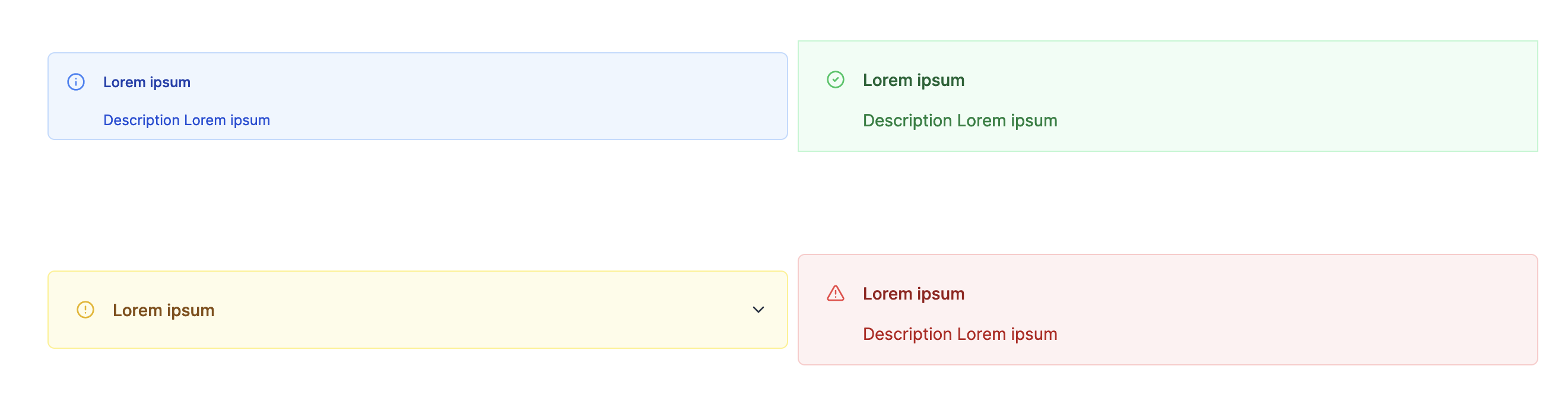
The alert component allows you to display a message in 4 different styles: info, success, warning, and error.
The following section details Alert component's specific settings. For more details on the App editor, check the dedicated documentation or the App editor Quickstart:
App editor Documentation
The app editor is a low-code builder to create custom User Interfaces with a mix of drag-and-drop and code.
Apps quickstart
Learn how to build your first app in a matter of minutes.
Alert configuration
| Name | Type | Connectable | Templatable | Default | Description |
|---|---|---|---|---|---|
| type | string | false | false | "info" | The type of the alert. Can be info, success, warning, or error. |
| title | string | false | false | "" | The title of the alert. |
| description | string | false | false | "" | The description of the alert. |
| Not rounded | boolean | false | false | false | Disable rounded corners. |
| tooltip | string | false | false | "" | The tooltip of the alert. |
| size | string | false | false | 'small' | The size of the alert. Can be extra small or small. |
| collapsible | boolean | false | false | false | Enable the alert to be collapsible. |
| Initially collapsed | boolean | false | false | false | Set the alert to be initially collapsed. |